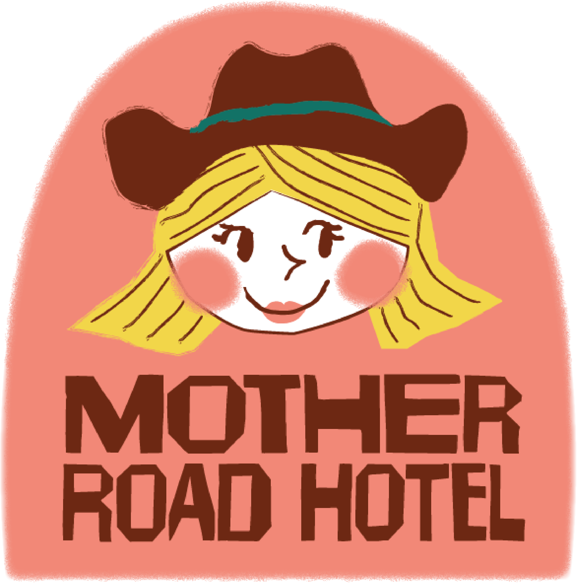
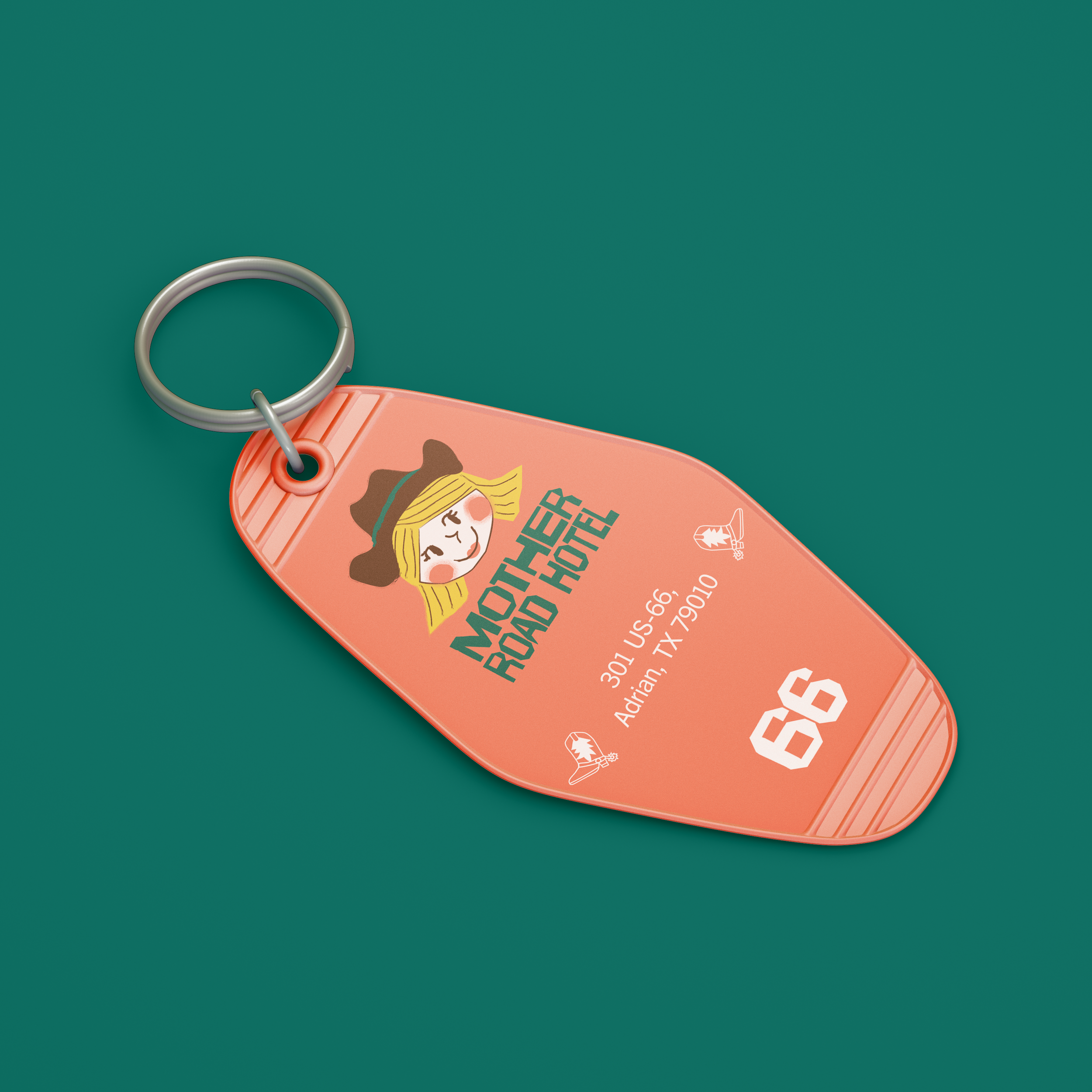
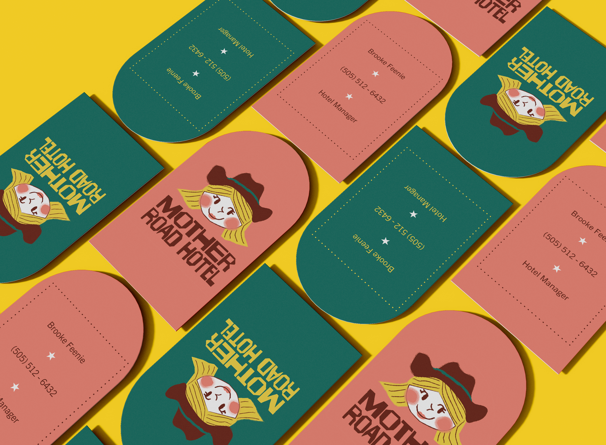
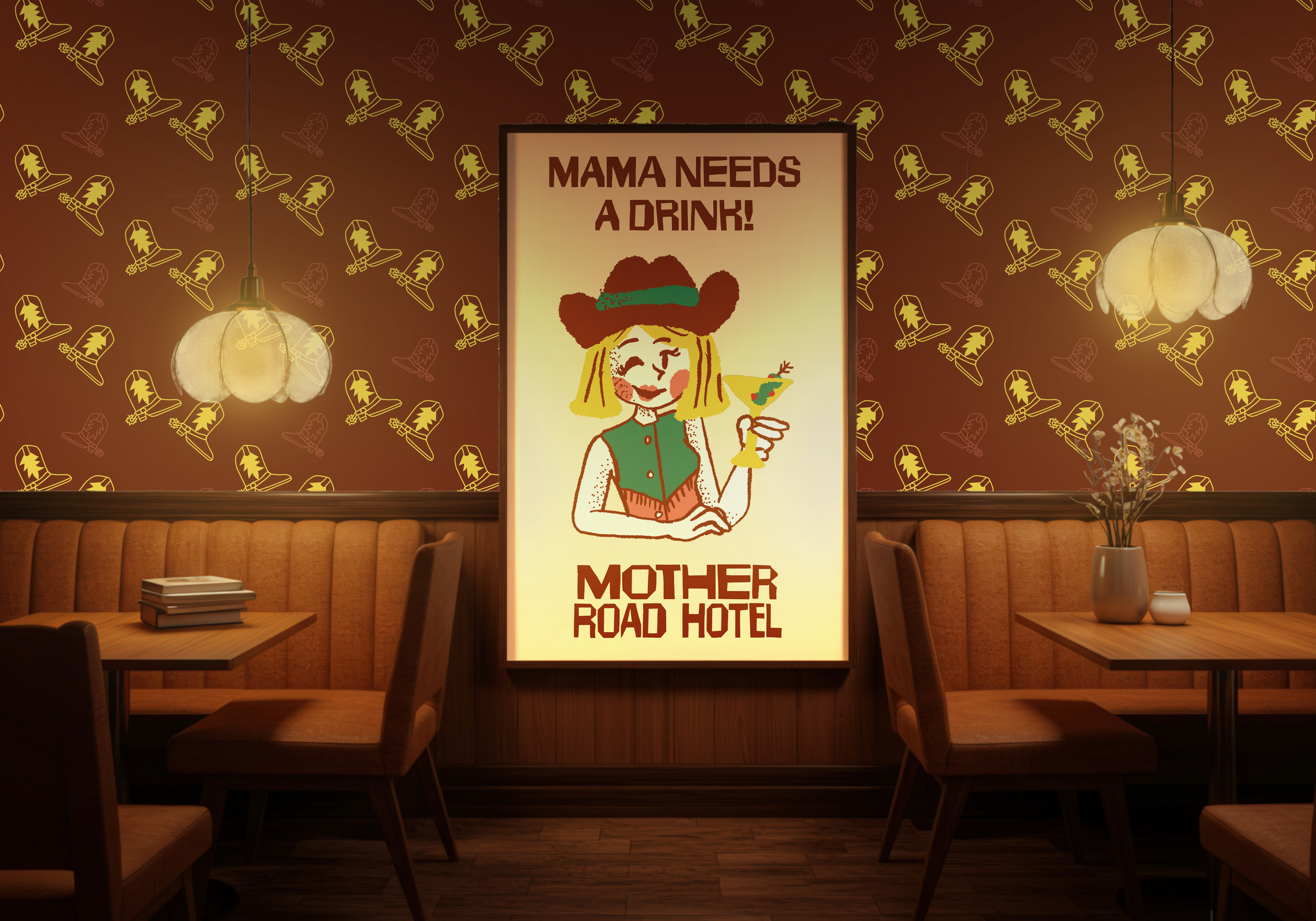
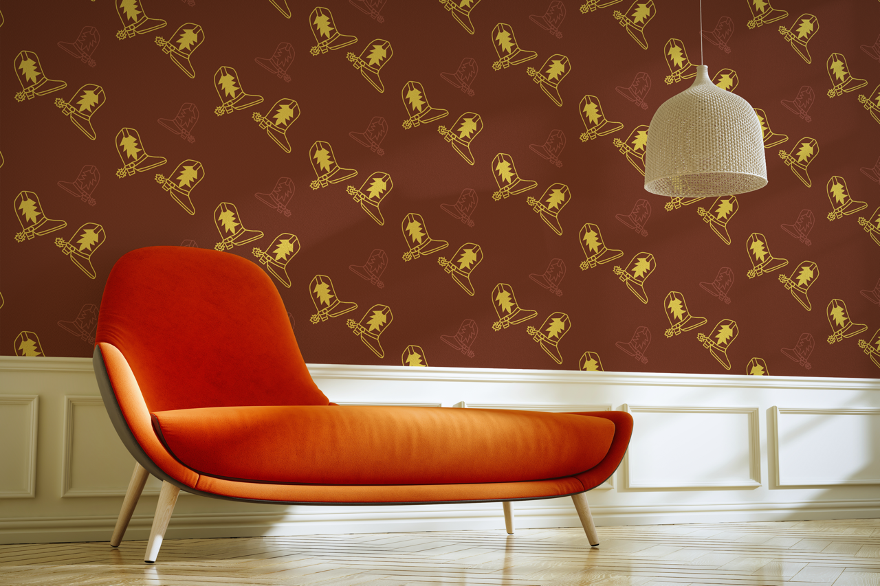
Mother Road Hotel
Mother Road Hotel is a series of boutique hotels along Route 66, a reflection of what once was, the original Great American Road Trip and the American Dream.
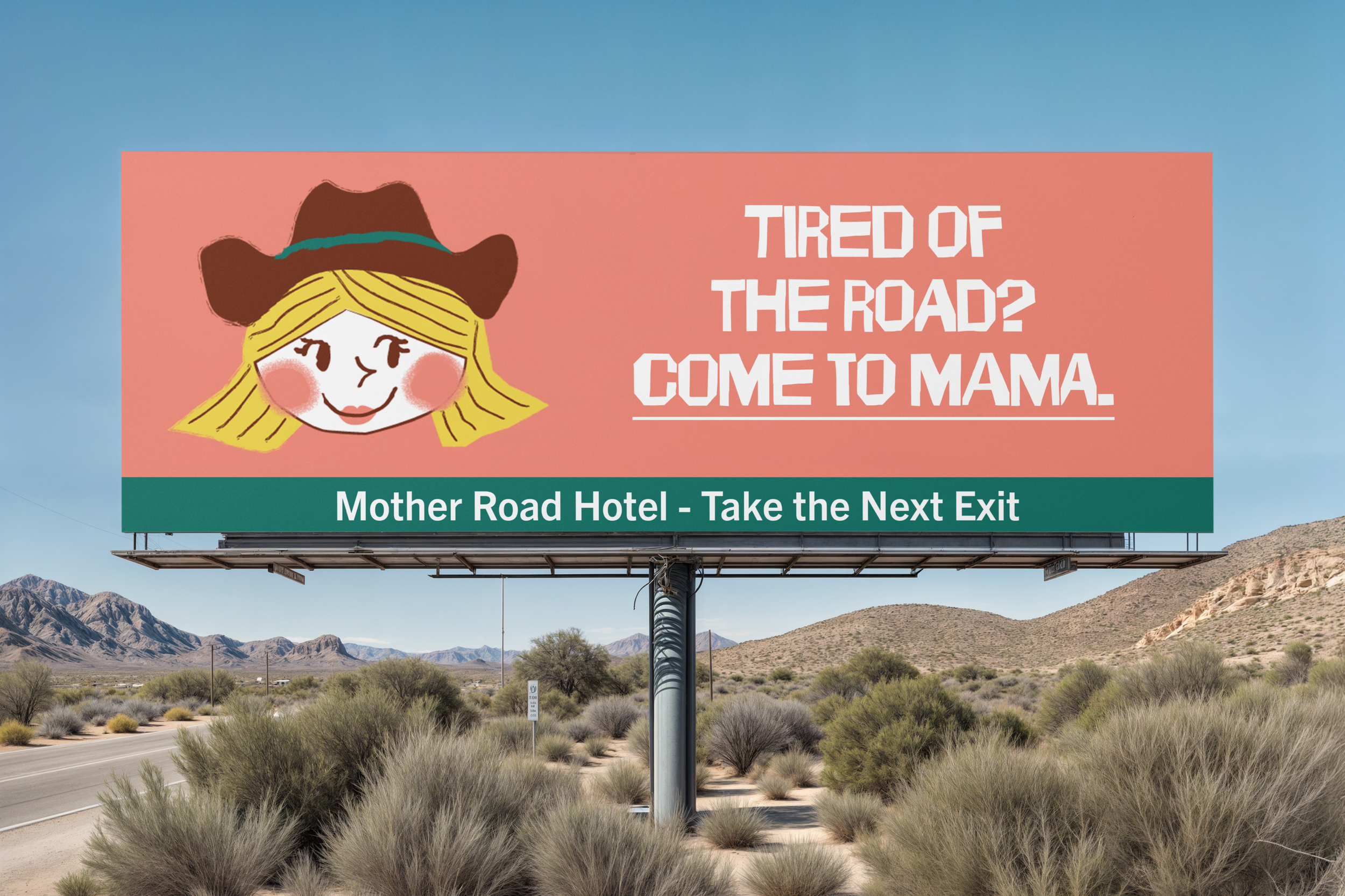
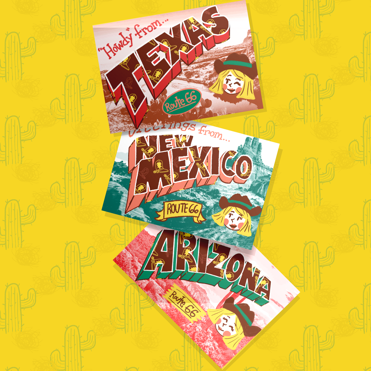
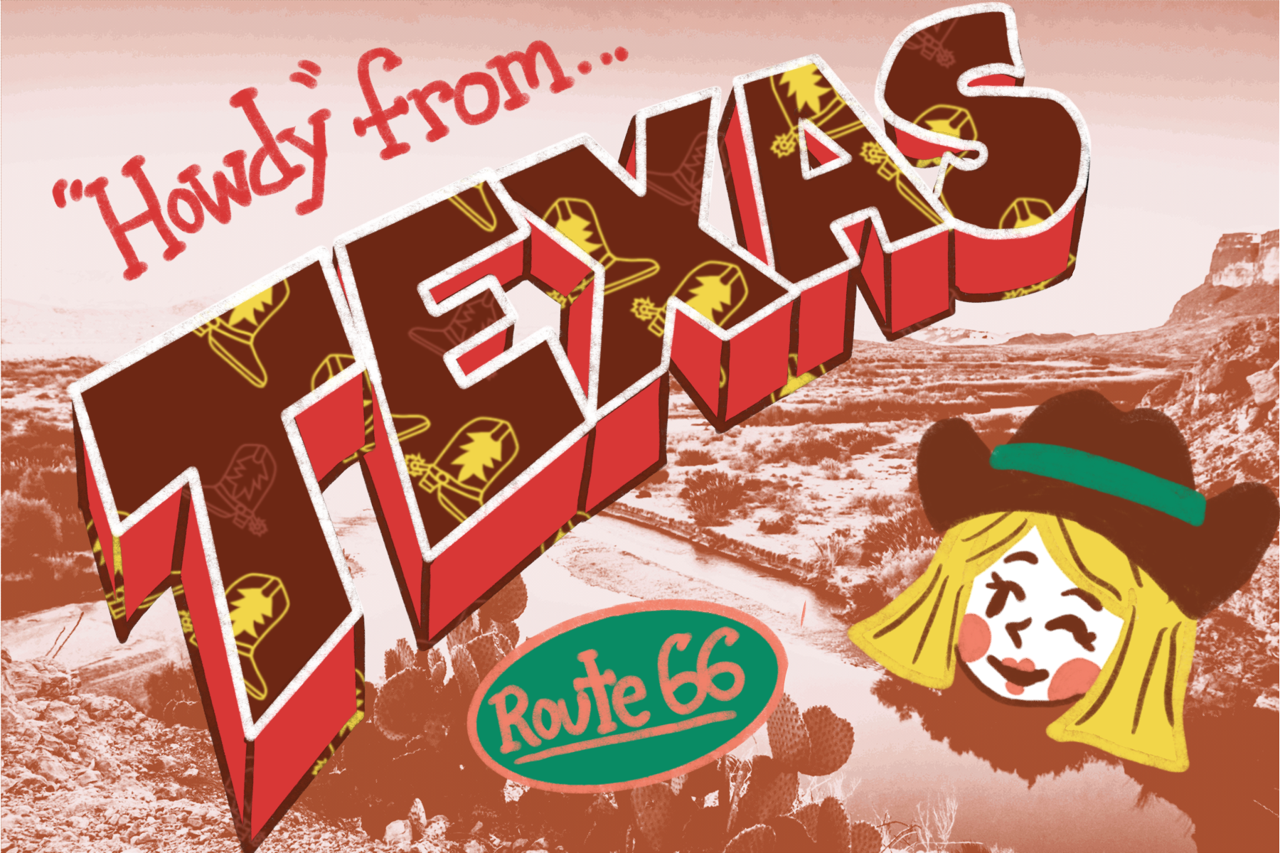
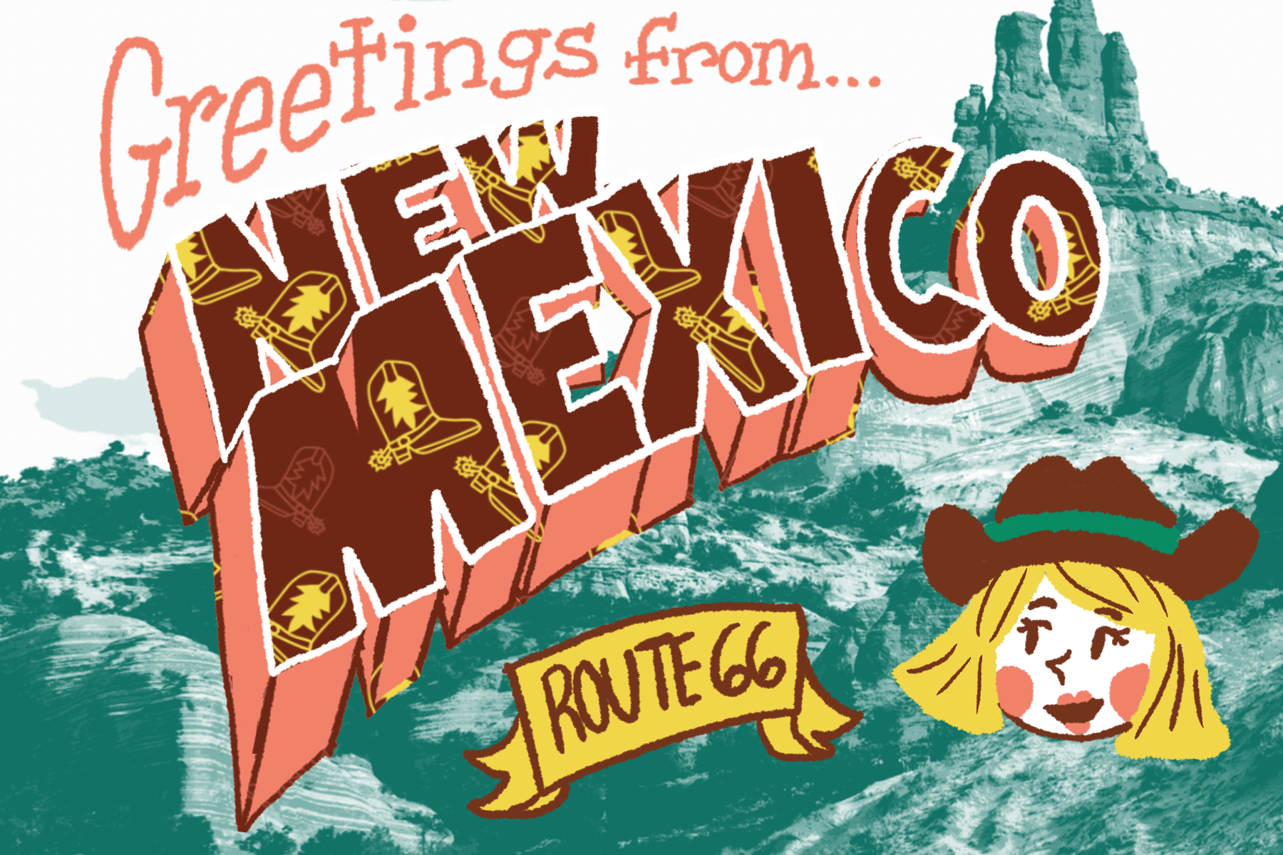
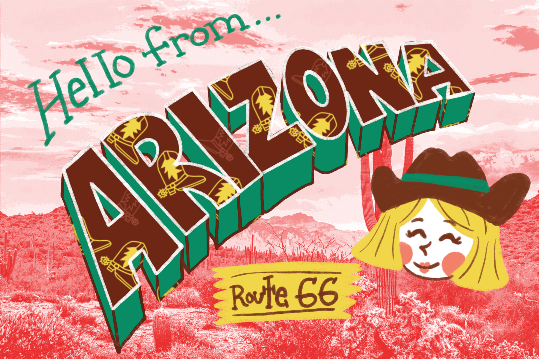
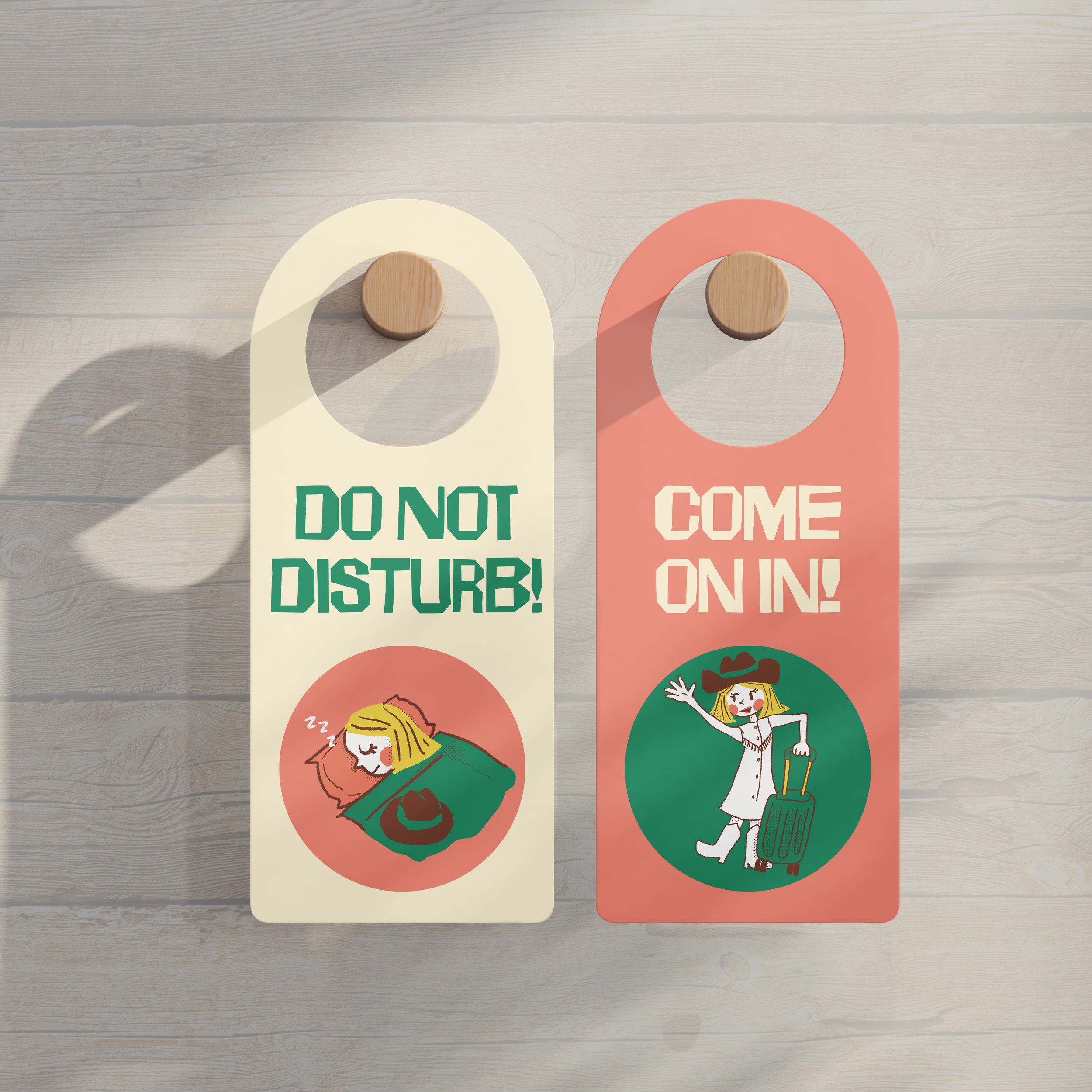
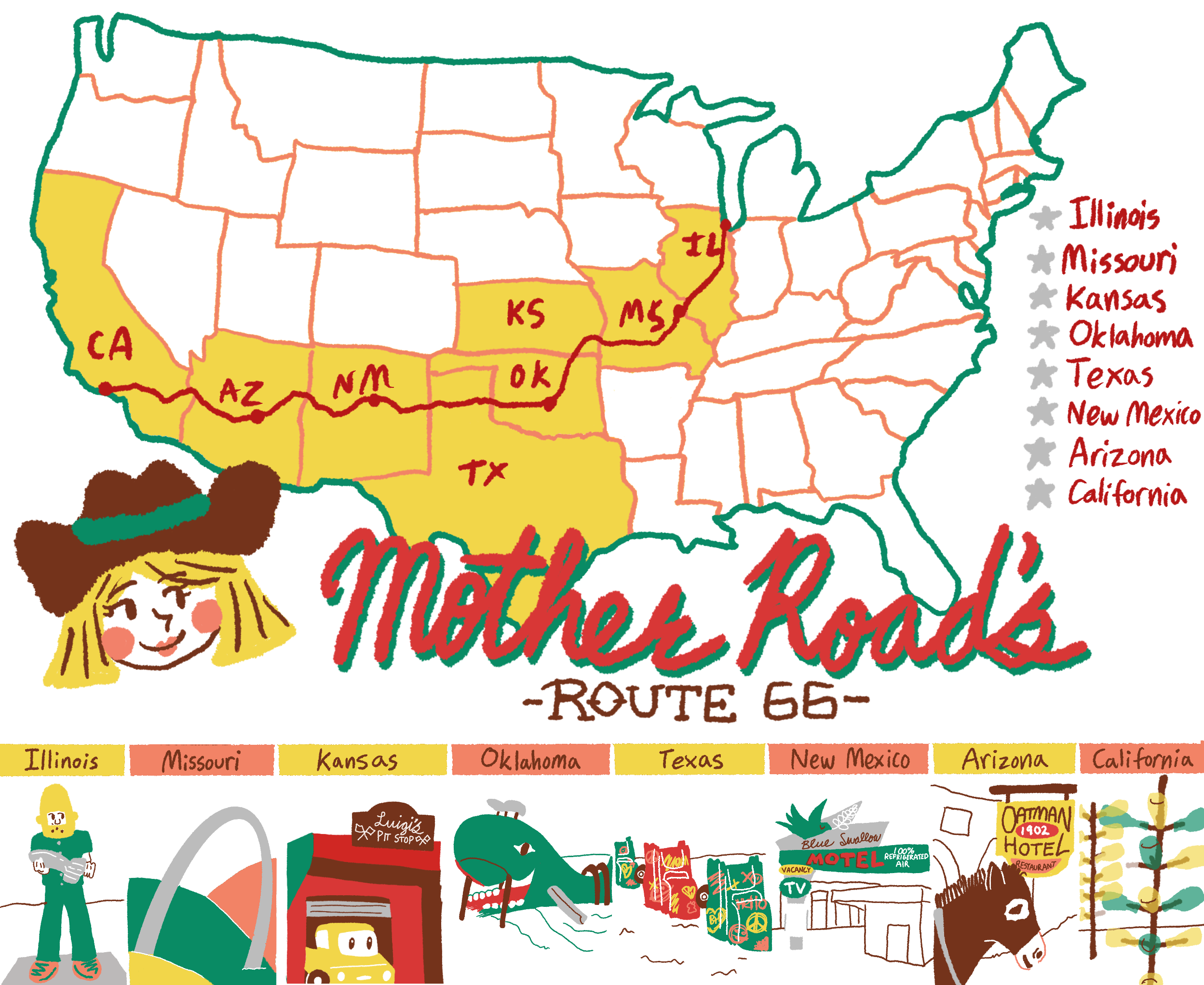
What if road trips didn’t have to be tainted by shady, run-down motels? I found myself stuck on the Route 66 road trip that my parents and I embarked on when I was 13. It was formative for me artistically, cultivating my love of kitsch, and it also showed me the reality of how many crappy roadside motels there are in America. Often, I found that these places put a subtle damper on the amazing, enriching experience this road trip was giving me. In such a tumultuous time of my life, being a teenager, I found comfort in that trip. Historically, Route 66 is hailed as “The Great American Road Trip”. While the true meaning and manifestation of the American Dream has changed over time, I believe that the innate desire to explore is still a shared feeling. “Mother Road” is a love letter to Route 66 and the run-down nostalgia of it all. It is a gleam of desire of what could be. It is a homey hotel that combines thoughtful branding with kitschy illustrations and designs.
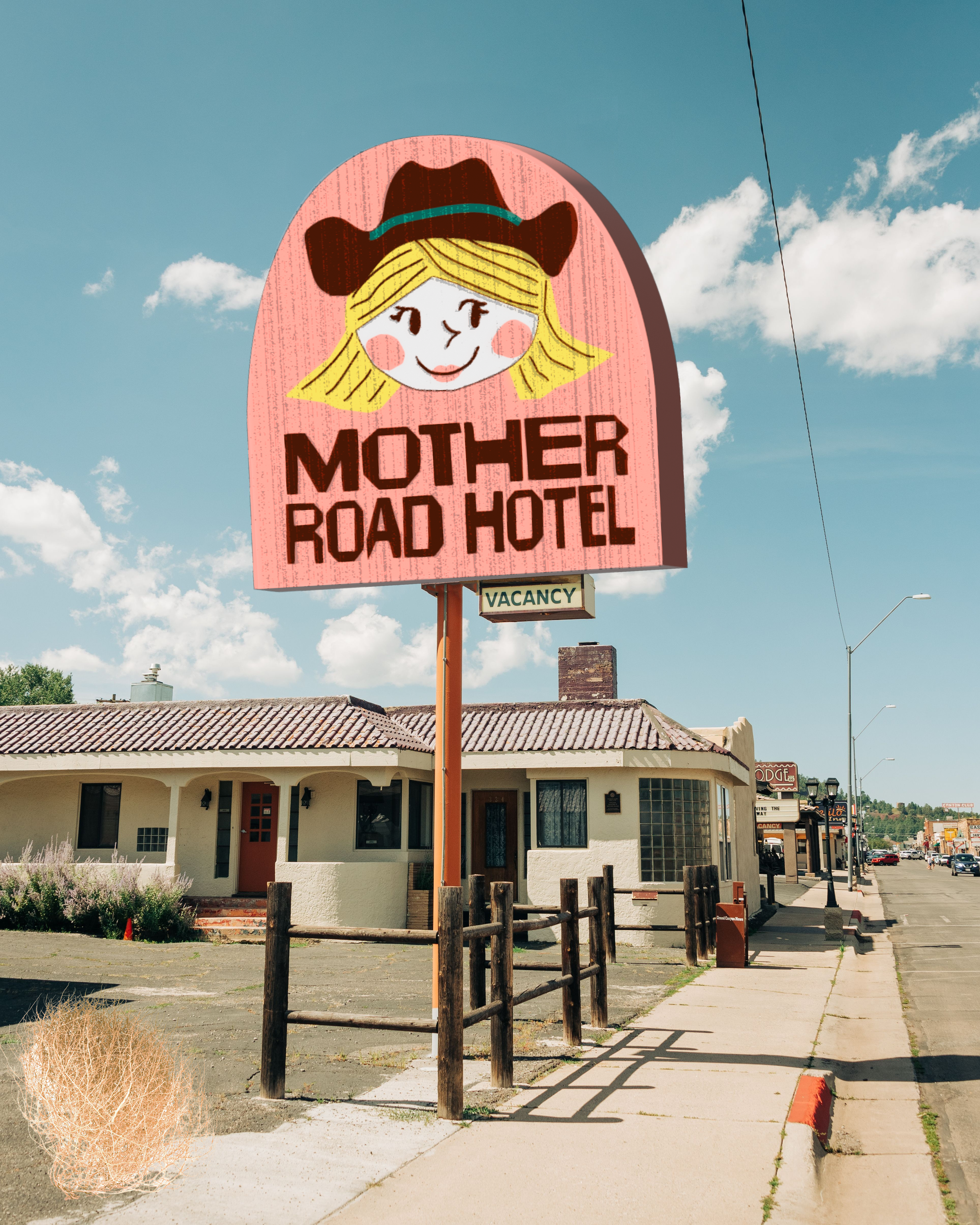
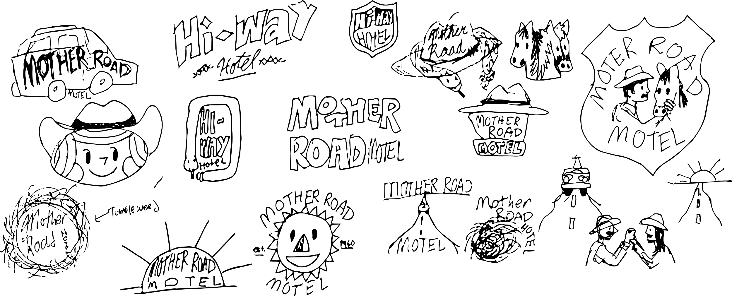
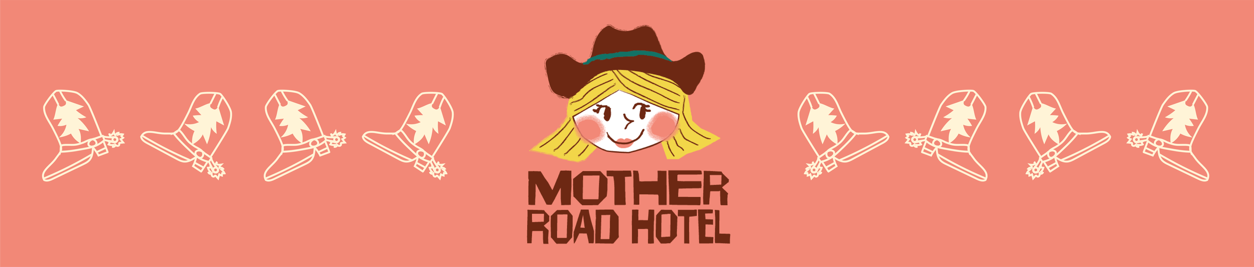
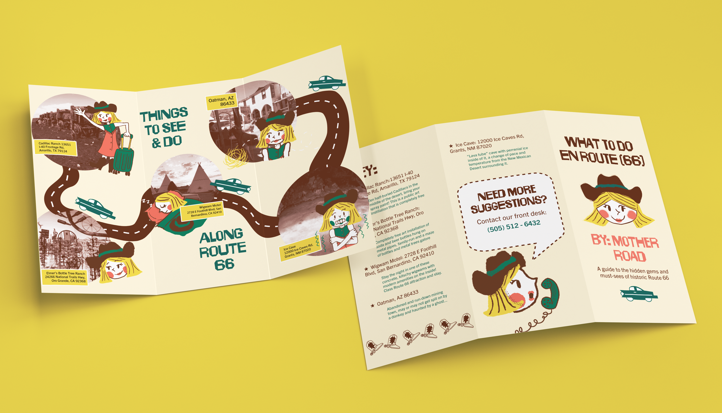
With the nature of a lot of Route 66 attractions being run down over time, I wanted to take a cheeky approach to highlight said attractions with a positive, lively character directing it all. Through my extended research and deep love for Mid-century Modern style, I cut and assembled paper with drawn lines/details on it to create the first logo. I then digitized the paper and cleaned it up, played around with colors, explored texture brushes, and ultimately chose a main font that was similar to the cut paper one I had attempted. I experimented with script fonts early on, but they felt too “on-the-nose" in a Mid-century Modern theme.

Most of the kitschy, Mid-Century Modern style hotels and attractions on Route 66 are gone by present day and replaced by dull, cookie-cutter chain hotels. Those that do remain do not expand their designs and branding to their full potential. This brand expands beyond the average hotel identity. It captures the perfect kitschy hotel vibe including a mascot with personality.
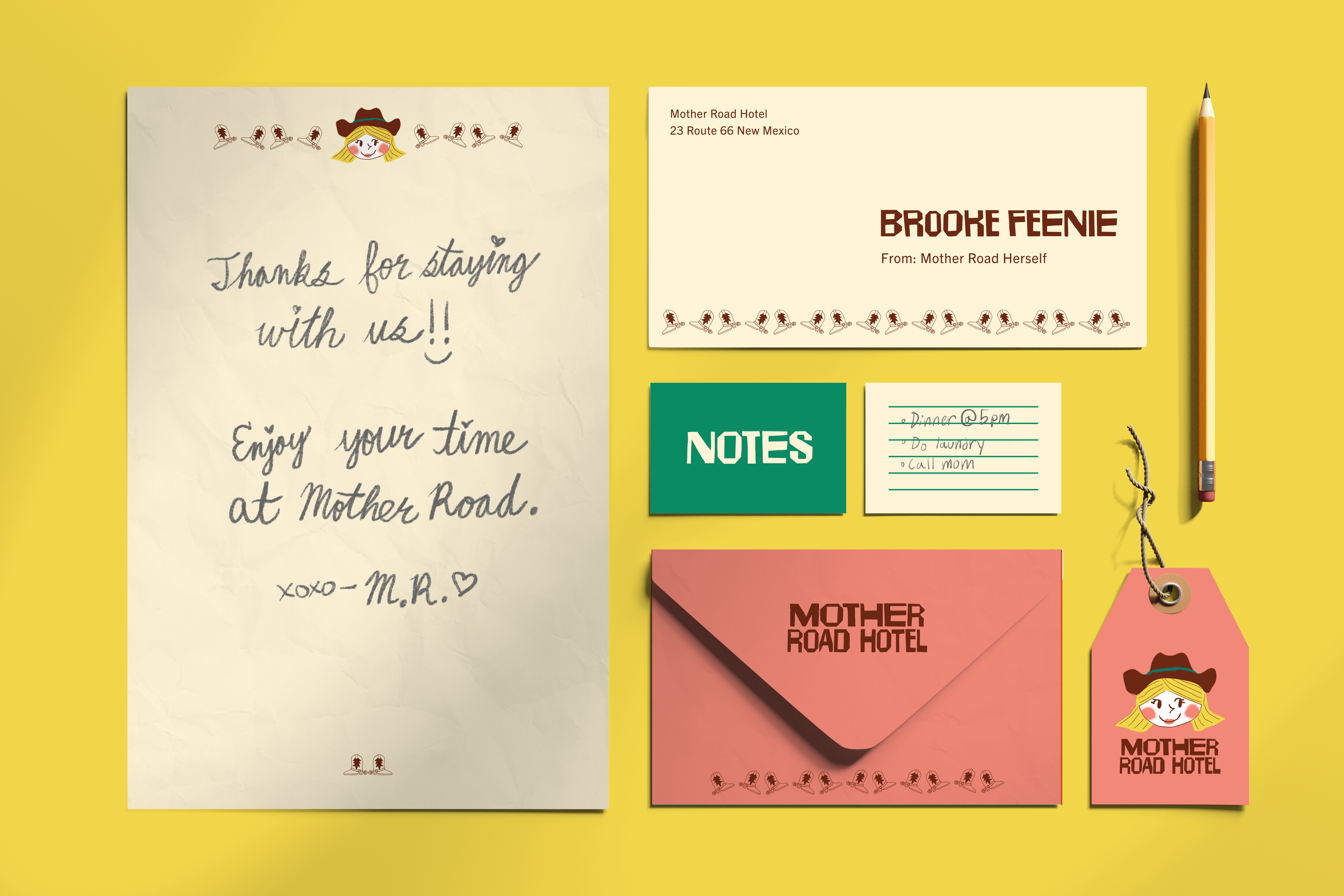
The original name for Route 66 was “Mother Road”, therefore I chose that name as a callback to the history of the great American road trip, and a hallmark to what said route was in its heyday, the mother of all road trips. Initially, the “mother” in my Mother Road logo did not look much like a mother herself. I looked back at books and articles about 1950’s cartoons and determined that adding lipstick to her was the perfect finishing touch.
Through this process, I learned the value of using tactile, physical mediums in the preliminary stages of a design project. Whilst things like cut paper are not practical to implement throughout a whole project (unless necessary), they allow us as artists to get concepts down with our hands before a computer can even touch it. We can make something real that has flaws and feelings. Throughout my thesis project, I read the book “Cartoon Modern – Style and Design in Fifties Animation” (2006) which shaped a lot of the artistic decisions I made throughout the process. Seeing Mid-century Modern design that I had not seen before from my peers shaped my goals for this project and the decisions I made.
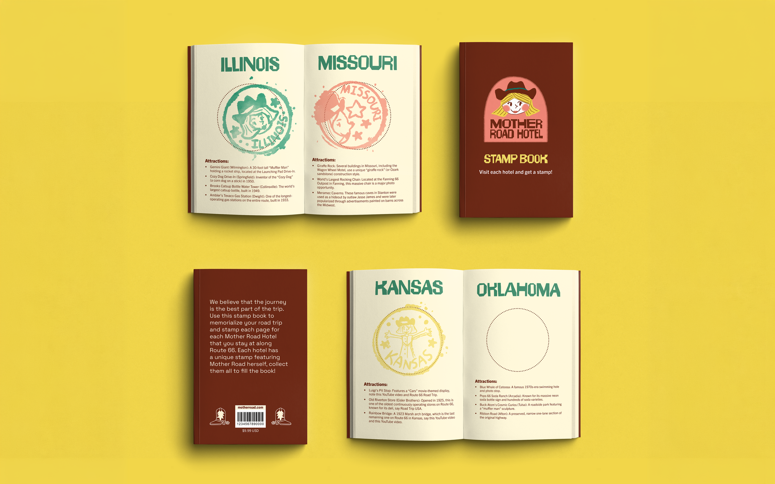
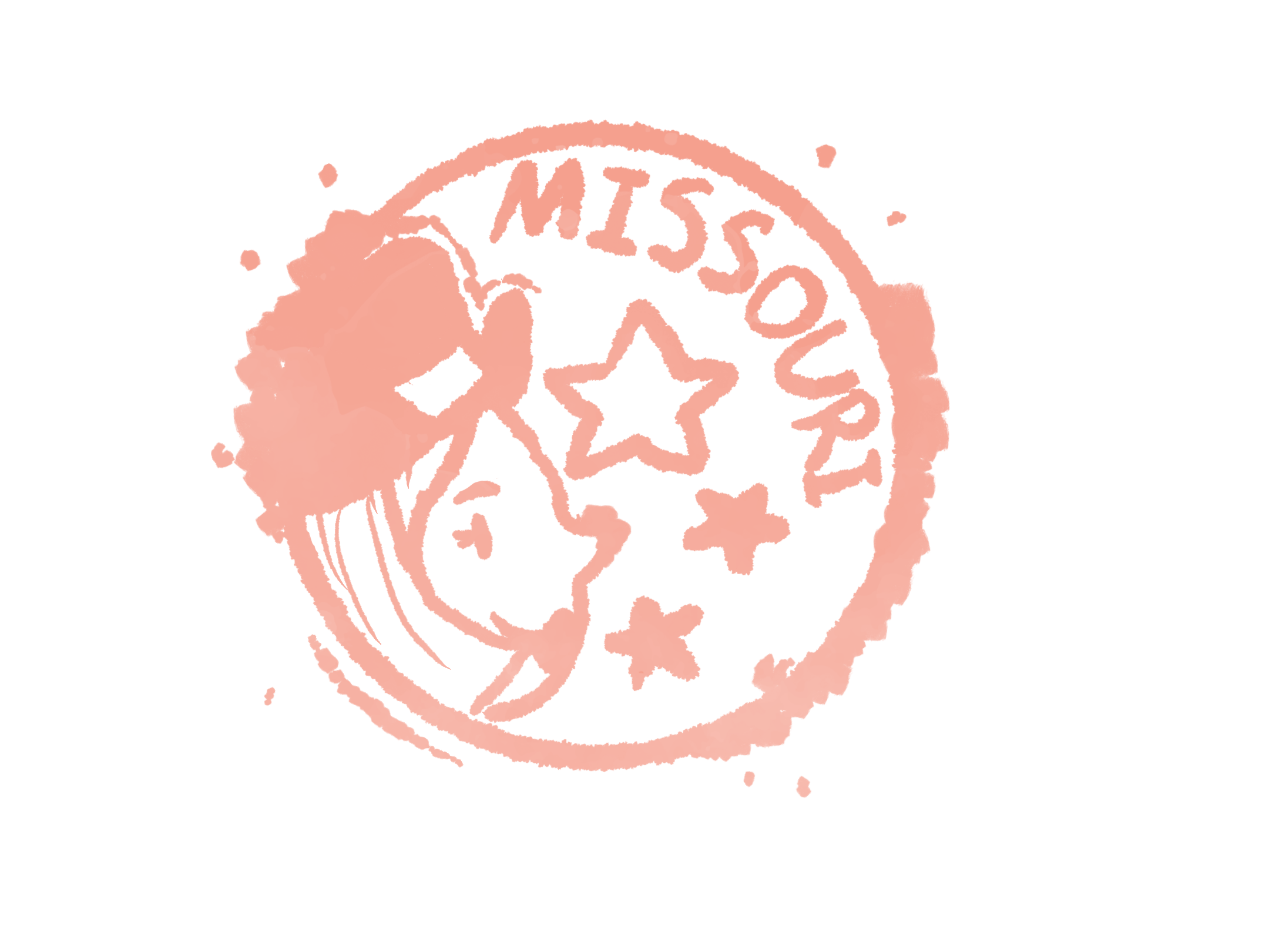
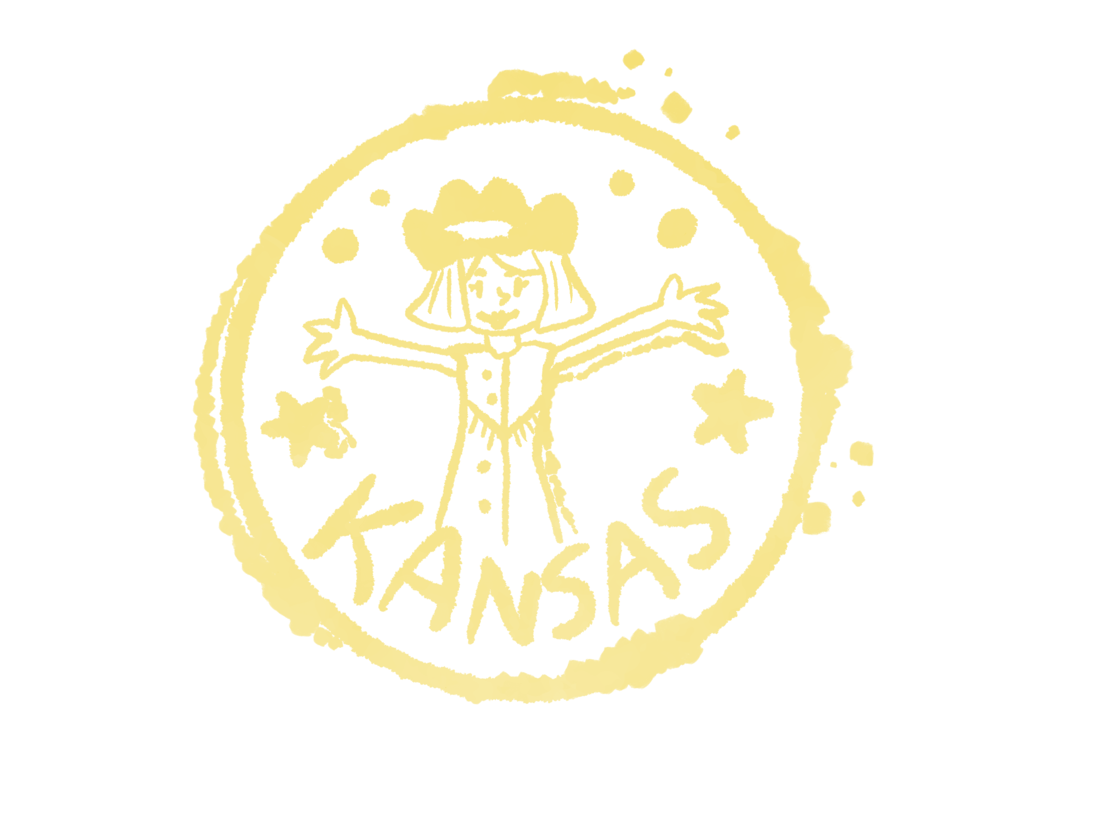
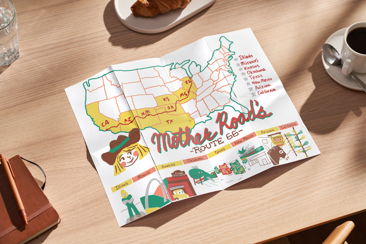
If given the opportunity to expand this project, I would turn this into a series of hotels a day’s drive apart along route 66. They would keep the same mascot but have unique maps and local attraction pamphlets at each location, all in line with the base brand. This way, there is a consistent, bright, and fun identity at each hotel, adding a sense of happiness and whimsy to the trip. With more time and resources, I would have loved to experiment in more of this project with cut paper, but it just was not practical with the timeline.